Ideas when it comes to designing interior and exterior banners for maximum viewing.
Question: Today, John M. asks “I’m designing my own banners. Do you have any advice for me on how to design banners for maximum success?
John, do I ever! I am all about good advice, particularly when designing banners or signs, both for interior and exterior usage.
The Biggest Factors
The principles are pretty much the same for designing any banner. The biggest factors are location, location, location, and size and succinctness of copy.
If you’re going to be having a big sale on say, fishing poles, at your sporting goods store, the first thing you’ll want to do is have some outdoor banners shouting out to all fishermen to come in to see your grand selection of magnificent fishing poles at ridiculously low prices.
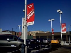
If at all possible, you’ll want your banners to be perpendicular to the flow of traffic. Research done by the United States Sign Council has determined, scientifically, that banners and signs that are viewed perpendicularly to the street are 80% more likely to be read than a banner that is parallel to the street, and that the letters on a parallel sign or banner need to be nearly double the size of one that is read straight ahead.
Furthermore, to determine the banner letter height (the same holds just the same for signs), refer to my blog post, a five part article on sizing of signs and letters – in it I discuss how the USSC has determined many possible variables including how many lanes of traffic there are passing by your store, the average speed of vehicles passing it, and the optimal viewing distance to spot your amazingly designed banner.
The Rule of Thumb
As a rule of thumb, your letters should be about 1” in height for every 25 feet of viewing distance, so that, if you want potential fishermen to see your sign at 1000 feet away, your letters will be in the neighborhood of 40 inches tall, depending also on the number of lanes and traffic speed.
 Your banner should also have at least 40% negative space, or area around the letters that are not part of a logo. So, maybe a picture of some fishing poles to the side or below the copy, so it gives your clients a quick visual and alerts all fishermen or fisherman wannabes to take notice, you have a most exciting sale on the best fishing gear in whatever city you’re in. If you don’t have enough space surrounding your letters, they become blurred at the distance you’re hoping your favorite fishermen will be able to read it at.
So, with 40 inch letters, you’re going to need a pretty succinct message for the sportsmen you hope to attract. Also, I need to tell you that at 1000 feet, your banner viewer has about one to two seconds to read whatever message you choose. So, you’ll want to keep it short, sweet, and to the point – maybe something like “All Fishing Gear 50% Off – This Week Only!” I think that would take about 2 seconds to read for your average fisherman. Maybe one second for the rest of us ;)
The Contents to include in your Banner
So, with these design principles in mind for your outdoor banner, the one that will drive clients to your front door, now you need to think about what to put on your interior banners. Obviously, you’ll want that banner front and center when the thundering herd of fishermen stampede into the store on the first day of the sale (and the 2nd and 3rd etc.).
Depending on the size of your store, but let’s say yours is a large box sporting goods stores that carries everything from arrows to athletic clothing to athletic gear, the first banner should, in bold print, point to where the fishing gear is. As a fisherman turns in the direction of the arrow, he should be able to see, even if it’s 300 feet across your store, another large banner or sign indicating that this is where the action is – 50% off all fishing gear, right here!
So, John, hopefully this will give you some good ideas as far as banner design elements, placement, and verbiage to drive hundreds or thousands of clients through the door of your business. The rest is up to you.
Popular Posts:


