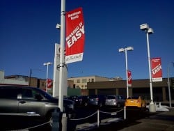
The letter height visibility, amount of copy needed, and readability in traffic of outdoor banners and signs.
Question: I need a banner that is visible from 150 to 200 feet away as cars are driving past my business. What letter height should I have on the banner to make sure passing motorists see my business’ banner?
This is a very good question that many graphic designers completely ignore in designing outdoor signs and banners, but is perhaps the most important question that you can ask. The other question that I would pair with this is, “How much copy can be read in that 150 to 200 feet.”
 It is important to know how fast traffic moves by the banner or sign on your business, and brand recognition can be helpful for customers looking for your business in keeping your copy to a minimum.
However, most companies do NOT have brand recognition like major banks or retail store chains, so they’re stuck with educating passersby of what their particular business does or can do for them.
A Short Illustration
Let’s say that you are looking for a computer repair store because your laptop’s hard drive froze up. You look online for a company that repairs laptop computers in your town or city, and come up with a company that looks like it will be perfect for the repair. You call them, and sure enough, you like what they say, so you hop in your car to take your laptop to their shop.
So far, this business is doing everything right. Their online presence is decent, and they answered their phone promptly and told you what you wanted to know and that they could, indeed, repair your laptop and recover your lost data.
So you drive to the address given, but there is a banner advertising computer games for as low as $20, but nothing else. Do you have the right store? Are they qualified to repair computers? It would be better for this store to have just a sign with their business name and a brief description of services than no sign and a banner advertising video games.
When a potential client is seeking your business, they do NOT want anything to seem amiss. From the online search to the phone call, if made, to the appearance of the business, to the appearance and knowledgeability of the employees once you actually enter the business.
Visibility of Letters in Relation to Viewing Distance
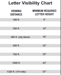
However, the original question, which I’ve strayed from momentarily to give you, dear reader, some great marketing advice, had to do with letter height and distances. I have the following letter height chart showing how tall of a letter you need to be able to read it from a specific distance. Disclaimer: this assumes you have fairly normal vision with our without glasses or contacts.
 This chart is by no means exhaustive. There are a lot of other factors that affect readability such as light conditions, pitch or angle of the sign from the street where your customer is driving by, speed at which the customer may be driving, color combinations of letters, whether the letters are neon, electrical, or appliqued to a banner, etc.
It is instructive to note that a 16” letter, though, is readable from about a city block away, or 360 ft., just a bit longer than an American football field. It is also instructive to note that the list in the previous paragraph gives you a pretty good idea of other variables, so the size above is not “set in stone.”
Typically, the average reader can digest about 5 words at 40 miles per hour at a distance of a city block, so the rule of thumb for your outdoor business signs or banners is to keep it simple and readable. Your customers will appreciate you for it.
To get more details on banner graphic displays, go to this page: https://www.visigraph.com/fabric-vinyl-cloth-banners/
If you are looking for signs aside from banners above, visit here: https://www.visigraph.com/signs-letters/
Popular Posts:


