The usage of pantone color matching for banner and poster printing, and the graphic lettering sizes to use in order to make a readable signage for better viewing.
Question: From today’s mail bag, Joe M. has asked if we can print Pantone Matching System® (PMS) colors on banners or posters?
Joe, the answer to your question is generally “yes.” Most printing equipment today, which includes screen printing, offset printing (lithographic printing), dye sublimation fabric printing, flexographic printing, and digital printing, to name a few, are capable, some at the entry of the PMS number into the printer’s computer, to get within 1 or 2% of the PMS color specified.
 Exceptions to this are screen printing and some digital printing. Most screen printers use percentage formulas from their particular ink supplier and a gram scale to mix PMS colors, which is a bit cumbersome, but relatively accurate. Screen printers and other printers often have an additional fee to mix PMS colors as it can take some time to mix each individual color.
Digital printing and dye sublimation printing uses more of a hit-and-miss approach, although many of the newer printers have CMYK (cyan-magenta-yellow-black) color mix formulas to achieve specific colors. Some printers also have two added colors – light cyan and light magenta – to assist in achieving some of the harder to achieve colors like reflex blue, for instance. An experienced printer can often achieve PMS colors relatively quickly, though again, some printers charge matching fees as it can take some time to “hit” the specified PMS color.
Most offset and flexographic printers (equipment) are able to code in the colors, but occasionally still small adjustments need to be made to the CMYK ink output to strike a color more exactly. Various materials also will affect the view of the color, so on-the-fly adjustments are frequently necessary to achieve just the right tone. Again, some printers will charge a small fee for PMS colors with these types of printing as well.
Question: Leanne H. wants to know, “We are looking to purchase some posters and banners and would like to know how large the letters should be to be readable at a distance. Please recommend sizing please.
Thanks for the question, Leanne. It is a good one that many advertising agencies and designers ignore because they’re too consumed with making artwork that is ultimately difficult to read, but pretty (in some cases, not so pretty).
Sign Letter Sizes for Better Viewing
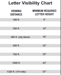
I wrote a five-part article regarding letter sizing for signs a couple weeks back, but it dealt mostly with outdoor signs, and not with interior posters or signs. There is a rule of thumb, though, about one inch of letter height for every 25 feet of viewing distance.
So, if your store is in a shopping mall, and you want to catch the eye of people walking into the mall from a main entrance, and your store is 200 feet away, with a straight view to your banner, you’d need at least eight inch letters to be read clearly from that distance. However, you might want to err on the side of overkill and go to a ten or twelve inch letter for greater impact.
 When the customer sees your banner, and decides to visit your store for your sales event or free coffee and chocolate chip cookies, or whatever your banner is advertising, and walks into your store, now the viewing distance to your posters which are also advertising your event are maybe 50 feet from the door or less. You’ll want a minimum of a two inch letter so they can continue toward what they came into your store to get.
If your goal is to get them to get close to the poster to read smaller copy, then you’ll use the large letters to invite them to read the poster which will have important information about why you’re giving away coffee and cookies or what departments have slashed pricing for the clearance sale you’re advertising.
So, when it comes to letters, size matters, a lot. Too small of letters and you’re not going to attract the attention you want, so get your letter sizing up.
The Other Factor
One other factor which you may not have thought about is the angle of your banner. Let’s say a mall-goer walks into the same mall entrance, and your store is on the side, 100 feet away. For banners parallel to your viewer’s vision, the letters should be twice as large to catch your potential customer’s eye. So, the same banner should be used, more or less, for the straight ahead view as the side view, even though the straight on view is double the distance.
One caveat to this is that people are moving more slowly than cars, and so they have time to look around more in a mall. However, if you’re wanting to gain the attention of mall shoppers, you’d do better to go bigger and bolder. After all, why take the chance that you may not be seen among the clutter of signs?
Popular Posts:


