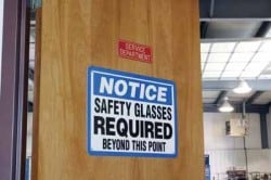
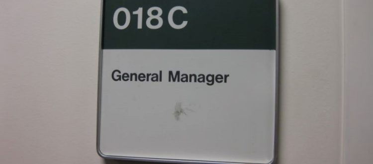
When you use office signs outside your door, you can almost imagine the inevitable big sigh of relief from those seeking your services.
Most businesses look more, or less, alike and only high quality, easily seen signage can spell the difference between missions accomplished and being lost in never-never land.
Making a Decent Office Sign

When it comes to these sign displays, clear spelling, a nice upbeat color and eye level installation do a lot to ensure that the ones you chose will do their job in getting your clients in your front door.
They can be a source of pride like any other decorative addition to your work area. They may be brightly painted, designed with a meaningful logo or symbol to help clarify, at a distance, what your firm is all about. A picture is worth a thousand words, and here is just the same. They can be wooden, synthetic, hanging, mounted, or in posts or pillars in the ground.
They may be hung on an outdoor fence railing. There are those that look homemade, like professional carpentry – or rather formidable. There are as many varieties as there are people. The main purpose of business signs is to identify your firm so that the postman, clients, and others who are trying to find you can do so effortlessly and independently.
Almost every entrepreneur who has “hung out his shingle” relies greatly on his or her signpost to get walk in customers and the publicity of being the neighborhood expert. Passersby see yours and read it on a daily basis, if not consciously, then subconsciously. This is a great way to promote your firm in an everyday way. Dentists, lawyers, court interpreters and specialist of all types use one near their entry door or on the street.
The graphic lettering should be attractive, elegant, impressive – and most of all easy to read. What’s the point of having one that no one can understand? Too many loops or a hard to decipher font may bring more confusion than assistance in bridging the gap between you and your client. It should reinforce your professional image as a solid, trustworthy and honest firm to do business with. The background color needs to support the message, not compete with it. Beyond a doubt, the graphics, like human beings, have the opportunity to make a powerful, and lasting, first impression.
The Dimensions
What are the normal dimensions for office signs? They can be in most cases in a quadrant shape, either a square or a rectangle. Other firms like to jazz it up a little with an oval shape that is posted to the wall outside their office. They may opt for a chevron shape, which is a shield shaped format with plenty of room to post the name, type of firm and owners names, as need be.
Signs Designed for Business
Those for business have been around since the Middle Ages when the guilds began encouraging craftsmen to specialize in their individual work styles. These workers or masters of their crafts later branched out into individual existences away from the guilds, while remaining a card carrying member. In the old days, many used a shingle from their roofs to write their names and professional expertise so that the public would be informed of the services they provided. That was over 500 years ago, and it’s still true today.
Nowadays, physical displays continue to provide a necessary service. The internet notwithstanding, a sign is a sign, and a well presented one can often make the difference between being found and discovered or being completely left out of the loop. Additionally, they leave a good impression and give the client a basis on which to judge the type of work that you provide. Even before the potential customer walks in your door, they get a good feeling or a negative one based on the look of them outside your door.
Aside from plastic office signs, they can also be crafted using other various materials: read here.
Popular Posts:


