How to calculate the negative space and copy area of Outdoor Signs to get best viewer impact.
Original Question: We are designing some banners for our business, and are discussing what colors to use on them. What input can you give us regarding contrast and overall banner color design.
As we have talked about in parts one and two in this article, just throwing a banner up on a wall or a sign on a pole could be some of the worst money you’ll ever waste if you don’t have a “scientific” method for determining the size of letters, negative space, and viewing distance for your sign, coupled with the reaction time an ordinary driver will have when they view your sign at 35 mph – give or take.
In this article, we’ll talk about copy area in combination with negative space to give your potential customer the best chance of reading your business advertising banners or main identification signage.
The Copy Area
The copy area of any banner or sign is the area of that sign covered by lettering, including the space between the letters, but not between lines of copy. When we are talking about lettering, this also will include any other graphics, photos, or illustrations that might be used, including your business logo, which may or may not include any copy or the name of your firm.

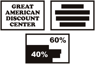
The copy area is of paramount importance, in combination with the negative space on your outdoor banners and/or sign, because it is what gives your sign decent legibility over an extended distance – which is where your potential clients will more than likely be viewing your sign from. The following illustration demonstrates copy area/negative space. On the left you see a typical sign face or banner, and on the right, a visual illustration of the copy area.
The Negative Space
Negative space is that area that is not in the copy or logo area. As stated previously, without this area, your sign or banner would be rendered virtually unreadable, and if too little negative space is appropriated, it can have damaging affects on the readability of your sign or banners.

The following illustration shows the percentage recommended by the United States Sign Council as a “rule of thumb” for negative space on your advertising signs. The bottom illustration shows the combined percentages grouped. Typically, approximately 40% of the sign surface should be the negative space component of its readability, and approximately 60% should be copy. Again, this is a basic guideline, so if you are at 42% and 58%, you would be likely be within good design characteristics for your signage.
How to Determine What Size of Sign Your Business Needs
As we’ve been discussing, there are factors such as VRT (Viewer Reaction Time), VRD (Viewer Reaction Distance), Letter Height, Copy Area, and Negative Space that need to be determined, and once these factors have been determined, it is possible to determine the size of sign your business will require.
The 10 Steps
There are 10 steps used to determine the size of banner or sign needed. They are as follows –
- Determine speed of travel (MPH) in feet per second (FPS): (MPH x 1.47)
- Determine Viewer Reaction Time (VRT)
- Determine Viewer Reaction Distance (VRT x FPS)
- Determine Letter Height in inches by reference to the Legibility Index (LI): (VRD/LI)
- Determine Single Letter Area in square inches (square the letter height to obtain area occupied by single letter and its adjoining letter space)
- Determine Single Letter Area in square feet: Single Letter Area in square inches/144)
- Determine Copy Area (Single Letter Area in square feet x total number of letters plus area of any symbols in square feet)
- Determine Negative Space Area at 60% of Sign Area (Copy Area x 1.5)
- Add Copy Area to Negative Space Area
- Result is Area of Sign in square feet
Applying the 10 Steps
Let’s see how this works in “real” life…
- Our car is travelling at 45mph – so 45 x 1.47 = 66 feet per second (FPS)
- In a multi-lane high speed environment, as we determined in part one of this article, the viewer will need about 12 seconds to react
- Our equation to ascertain the Viewer Reaction Distance would be 66fps x 12sec = 792 ft (VRD)
- 792 feet is our VRD. We’ll arbitrarily, for this calculation, use the LI of 30 from part 2 of this series. The formula here is 792 / 30 = 27 inch letters
- The area of a single 27 inch letter would be 729 square inches per letter – 27² inches
- 729 / 144 = approx. 5 square feet per letter
- For our purposes, we are going to have a banner made that says “GRAND OPENING THIS WEEK” – so our formula here will be 20 letters x 5 sq. ft. per letter = 100 square feet
- Negative space will be 100 x 1.5 = 150 square feet
- Your designer can now determine the approximate size of your banner based on this calculation by adding the copy to the negative space
Based on the above calculation, our 28 ft. x 7 ft. banner might look something like this –

In Part 4, we’ll go into specific formulations for the area of a sign that hone in a little more scientifically on how we calculate signs both in perpendicular and parallel environments.
Popular Posts:


