How to calculate the area needed for outdoor business signs and banners.
Original Question: We are designing some banners for our business, and are discussing what colors to use on them. What input can you give us regarding contrast and overall banner color design.
In this section, Part 4 of this series, we’ll start by looking at more precise calculations for determining the area needed for a sign or banner.
Personally, I am not a big fan of algebra, but sometimes the easiest way to calculate what the Area of a sign (Asign) is by using one, especially if someone else has already done the work to come up with it, which, in our case, the USSC has already done for us.
The Equation
The only part of the equation that is left out is the negative space calculation, which is fixed at a 40/60 ratio with the copy area, or Copy Area x 1.5. Note that number rounding – which I do frequently – will yield a slight variance in copy area/negative space. As this is an inexact science to a degree, this rounding will likely have little affect on readability of your signs or banners. This is essentially the same formula used in Part 3, but it’s simplified from the 10 step equation to this –

Fixed Value:
- 40/60 ratio of copy area to negative space
Variable Values:
- N = number of letters
- VRT = Viewer Reaction Time
- MPH = Miles Per Hour being traveled
- LI = Legibility Index
Calculating the Area of the Sign
How do I use this equation in the real world?
1. First, take the number of letters (N) and multiply it times 3, then divide that by 80.
In our banner in Part 3, we had 20 letters (GRAND OPENING THIS WEEK).
So, we’d take 3 x 60 /80 = 0.75.
Set that number aside.
2. We want to multiply our VRT – 10 seconds – times the MPH – 40mph = 400
Divide it by the LI – 30 = 13.33 – and square it = 178 rounded up.
Now multiply 178 x .75 and your sign’s square footage would be 133.5.
Much simpler than the longhand equation, methinks!
A Simpler Equation
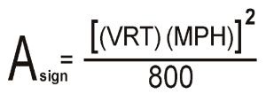
An even simpler equation, but with more fixed values, is this algebraic equation –

Fixed Values:
- Number of Letters – 30
- LI (Legibility Index) – 30
- Copy Area/Neg. Space – 60/40
Variable Values:
- VRT (Viewer Reaction Time)
- MPH (miles per hour)
This equation works quite simply as…
1. You multiply view reaction time – 10 seconds – times the miles per hour – 50mph = 500
2. Square 500 = 250,000
3. Divide it by 800 = 312.
This is the area of your sign.
Now you’d need to know that you’ll have 30 – 30 in. letters, which is a fixed value above, and that these letters will fit into this area. You may need to vary the sign area if the words require it, like we did on the Grand Opening banner in the last section.
Guidelines for Freestanding Perpendicular Signs
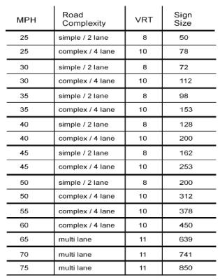
The chart below gives you some basic guidelines for freestanding perpendicular signs based on the size of the sign, view reaction time (VRT), speed of the vehicle (MPH), and lane complexity.

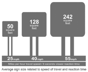
This illustration tells you how the sign sizing changes with speed –

Illustration from Street Graphics and the Law,
American Planning Association, 2004
In the final installment of this series, Part 5, I’ll discuss parallel signs. These present their own challenge, so I will deal with them completely separately from the previously discussed signage.
Popular Posts:


One thought on “Part 4: The Science of Outdoor Signs and Banners”