The effect of color in terms of getting your message out to your potential and target customers.
Question: Are their colors that I should or shouldn’t use on a trade show booth or the supporting graphics like banners stands or table runners?
I’m going to give you my opinion, as it is gained by observation of signs and graphics for over 20 years.Disclaimer: There is no scientific evidence backing up my conclusions unless coincidentally agreeing with me.
Your Message will Always be the Medium
First and foremost, the message is and will always be the medium. People are generally still fairly literate who are attending the trade show you’re exhibiting your goods or services at, so they’re scanning as they walk, and while color is important, what they read is what will bring them into your booth, not shiny stuff, unless you’re selling shiny stuff.
Designers are More on the Graphic Look
I will give graphic designers a nibble on this point. Flashy will catch the eye before your logos, headlines, and taglines. But on most other aspects of marketing and advertising, graphic designers are all about the look, and have little clue as to what makes people open up their wallets when the message is compelling.

Yellow and White Lettering on Red Background
The Color Matters
Next, I will say that color is extremely important. Yes, the message is of utmost importance, but if you put burgundy copy on a black background, the most compelling copy in the universe will be missed because it just got blended into the background by your eye. Photographic backgrounds, which are popular now, due to the availability of dye sublimation fabric banners and trade show displays and digital printing of various media, can be tricky as well due to the variation in the background coloration.

from designworkplan.com
Lettering Color Test on Red Background
1) Bright Yellow on a Bright Red Background
Many designers now are shying away from certain types of photographic backgrounds for this reason. The number one most effective visual effect color-wise is bright yellow on a bright red background. A large hamburger chain has effectively used this color scheme, along with brilliant marketing, to become the largest hamburger chain in the world. It was not, we believe, done purposely, other than that when the founder looked at signs, he noted that the best viewed color contrast was yellow on red. Later, scientific experiments backed this finding up. Sorry, I said I wouldn’t present scientific evidence of my claim, but at least I won’t cite any references.

from carenhackman.com
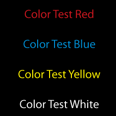
Lettering Color Test on Black Background
2) Yellow on Black, White on Red, and White on Black
The second best color contrast is yellow on black, then white on red and white on black. Letters reversed on a dark background will always read best and from the greatest distance. I remember this from reading numerous articles in sign journals as I was falling asleep. At any rate, this solid background can be terribly dull and boring, so graphic designers wandered away from it as digital printing of signs and banners became the norm late in the 20th century.
Conclusion
However, I believe due to the difficulty of reading signs that were too artistic, what I’m seeing from graphic designers now is a fusion of the two when and where it fits. A solid dark background (red or darker) with bright lettering (bright orange or lighter) with some photographic elements highlighting around the edges or in the gaps can provide some attractive trade show display graphics, and if your message resonates with your potential clients, you should have a very successful show.
Popular Posts:


